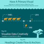
Infographic Best Practices
I had the opportunity to help out with an infographic design recently and it gave me to a great opportunity to explore this communication medium in general. There are some really great examples on Pinterest, and I highly recommend that as a tool for visually browsing…
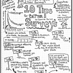
UPA 2012 Session Sketchnotes
I did back to back conferences this month, attending the UPA the day after flying out of Ohio from Midwest UX. Still excited about the sketchnoting workshop I had attended there I decided to see if I could keep it going throughout…
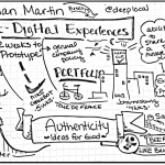
Midwest UX 2012 Session Sketchnotes
I’m so pleased that I was able to attend Midwest UX this year in my hometown of Columbus Ohio, and I was thrilled that it was hosted at COSI. It was a great conference with a lot of local talent…
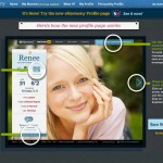
Falling for eHarmony.com
I happened to find out about the new eHarmony.com design purely by accident. A single friend of mine was getting her daily virtual flirting fix when she noticed that some areas of the website had been redesigned. Luckily, she had…
IA Summit 12: Clutter is King
I really enjoyed Clutter is King: The story of filing, piling and beyond and how people really get things done by Paris Buttfield-Addison and Jon Manning. It was an insightful look at the way that people organically organize information in the real world,…
IA Summit 12: Filtered and Refined
After the Better Cross Channel Experiences talk the next 20 minute talk for that session was Filtered & Refined: Interfaces for Distilling Data by Erin Jo Richey. This talk was all about the way that information is organized and presented…

Visualizing Information: The Netflix Network
Recently I came across the Visual Complexity website thanks to Adaptive Paths signposts for the week ending March 5th. A particular graphic by Christopher Hefele popped out at me called the NetFlix Similarity Map. Having written a paper on the intelligence of…