Maximize ROI: Turn Beginners into Experts
Turning beginners into experts is a valuable and important transition for business to facilitate. The more versed a users is in your product the more use and value they will be able to get out of it. The more value a user feels, the more likely they will be to use it again and share it with others. Making the transition from a beginner to an intermediate or expert becomes even more important in full screen attention maximizing applications, applications with high turn overs and products that have frequent updates and releases where users have to deal with change often.
Surprisingly, the often undervalued learning aids seen in interface designs are one of the most successful ways to help your users get from confused to competent Using different learning techniques correctly allows you to increase the value and complexity of your application without risking the learning curve. Advancing users and enabling them to become more productive, efficient, and informed, taking advantage of more features and functionality faster. Taking the intimidation out of technology can make products more enjoyable and create beneficial experiences that don’t take a huge investments to get up to going.
Why Learning Aids are Important
In sovereign applications designed for intermediate to expert users learning tools are crucial in getting users from novice to productive. It applies equally across both information and interaction design. However enterprise applications aren’t the only interfaces where people get confused. Every day new interfaces, applications and websites pop-up, many of them expecting us to modify our mental model to understand their concept model on the fly, but as Facebook has learned, people don’t respond well when you move their cheese, unless you can manage that change properly, and get people back up to speed quickly.
Tip flags, tours, guides, etc. These are not new ideas but unfortunately they are often underused in design. It is also usually the most complex software that looks past these tools, expecting users to take the time to learn with training, hours of discovery, social learning through friends and co-workers or by using the manuals and FAQ’s.
Learning tools are about subtle supplemental highlights at just the right moment. Done well they are nearly transparent while helping people get up to speed quickly and avoiding missed opportunities in functionality. Done poorly they become distracting annoyances and irritating interruptions. Like everything in interaction design, there is a fine art to getting it just right.
Learning tools aren’t just for first timers.
Even seasoned interaction professionals need learning aids. I had been talking about up-to-speed aids at work and a co-worker sent me an email after a very frustrating morning with her iPad. She said her iPad had been locked on the wrong orientation and she was unable to fix it. After much frustration she concluded the accelerometer was broken. It wasn’t until a couple weeks later when she was using her iPad with a co-worker that he suggested trying to double click the home button and swipe left to get to the orientation options. It fixed her “broken iPad” immediately. She found this very frustrating because the button on the side of the iPad had been remapped to a mute control and she had no idea it had happened. She was further confused because her iPhone still worked the original way. How could she have known?
I have had similar ah-ha moments myself. A few weekends ago my step-father showed me a panoramic feature on my phone, after I mentioned how much I hate that my phone didn’t have this feature and that I had been trying to find a suitable app for panoramic photos for years.
As Interface designers, our primary goal is to facilitate a conversations between people and technology and in order to facilitate that we can’t take for granted that over time the interactions will change and the user will need to be brought back up to speed. Learning tools help new users as well as existing users acclimating to our constant updates.
It’s normal for users to not to understand every interaction right away, and even for those of us who understand things quickly, there is usually an “ah-ha” moment for waiting down the road where we discover how to do something we never thought we could and didn’t know existed.
Whether you are learning something for the first time or relearning something that was known, when something changes everyone must re-frame their perspective. Built in learning aids support our growing communities of users in understanding the changes we make and improving their experiences by helping them move from beginners to intermediates and stay there.
Very large changes can be made without users noticing.
The estimate from neuroscientists is that our five senses are taking in 11 million pieces of information every second – Susan Weinschenk. Think about that for a second. All the senses we have trying to process all of the pieces of information in our environment pulling for our attention. Yet we only consciously process 40 pieces of information a second. That means the other 10 million 100 thousand and 9 hundred and 60 pieces of information every second are not getting our conscious attention. Then, even when we decide to pay attention to something in our environment or something that we are doing that doesn’t necessarily mean we will remember it. Our short term memory has a limited capacity and very short duration. Our long term memory isn’t great either. What we perceive does not automatically become learned memories, instead our perceptions often decay quickly.
We suffice, and learn only what we have to.
Add technology to the mix of the millions of every day pulls at our attention. Every day new interfaces, applications and websites pop-up, many of them expecting us to modify our mental model to understand their concept model on the fly. Worldwide 30 million apps are downloaded each day, and don’t forget about websites. These apps are constantly being updated. Trying to keep up with and learn how to use all of the technology in our environment takes a lot of conscious and focused attention.
To deal with this overwhelming pull at our attention we find ways to take shortcuts. Once we learn a sufficient way of doing something we latch on to that process and tend to favor it over other options, even possibly more efficient ones. Familiar tasks are easier to us because they require less cognitive load, less conscious attention. Looking for new solutions takes time, and cognitive load away from everything else we have to deal with. We will take a longer familiar path, over the work of finding a new quicker path when we need to get something done.
So imaging how frustrating it must be when you have gotten so used to something that you can nearly do it with your eyes closed and then the interface changes. Suddenly and without much choice, we have to focus on it again and learn a new way of accomplishing our goals.
Accomplishing goals faster and discovering the unknown.
Interface learning aids serve as a conversational tool between the application or website and its user. Good up to speed aids help shape a person’s understanding of the tools they work with by politely offering assistance to the new user, and pointing out changes to the returning user. Allowing users to get up to speed quickly and removing required attention will make them more efficient, and make the experience feel easier. Provide up-to-speed aids for users to become experts like keystrokes.
“Showing users exactly what they’re getting into and helping them get up to speed can make them comfortable, eager to dive in, and immediately knowledgeable.” – Designing the Obvious by Robert Hoekman Jr.
Learning tools allow our users to take full advantage of updates faster by providing a subtle tips and training in the system when and where you need them. These tools also help to set expectations, framing the important elements against the distractions. Showing them where to focus to see the primary goals of the interface. Draw people to, or call out important information that has changed in an interface, Offer help and user assistance features in the context where users need them so they don’t have to travel to a separate help section and memorize steps before returning to the problem at hand.
We naturally look for cues to help us reach our specific goals in the interface and tend to only notice things we think are related to our goal. We can aid users by providing clear information scents (cues)
6 Types of Learning Aids
There are 6 different types of up to speed aids that I have identified, and a few rules by which to best utilize them. There are two groups, 3 of the aids are for new users: They are Maps, guides, starters, and 3 are for existing users: Announcements, tours, and tips which are often seen after a change or update has been made to the system
Maps: Provide a high-level overview of the space.
Like a map at the beginning of a city. Give the user a high level overview of a new design or page layout prior to entering the page itself. they are not interactive, but rather a flat representation of features in a page, or across portions of the website. The take up only one panel or page and closing them takes you right into the website. Maps usually have cues called out to help the user understand areas or points of interest. They can show up when you enter the website of application for the first time, or if you enter a new page for use a feature or the first time.
Guides: Point out interesting landmarks and techniques.
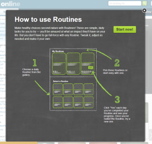
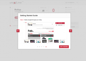
Like a guidebook you read that points out all the interesting stops you’ll want to make Guides are essentially interactive maps. Instead of showing just introductory functionality on one page, these are multiple pages long and go into more depth on the features available and how they are used. They provide additional assistance and direction by moving through various areas with map like cues however they are not in the context of the application like tours, they are visually separated from the task at hand and presented in their own dedicated set of pages or panels. They are often called “tours” but I separate them from tours because they are not in context. Guides, like a guidebook you read in advance, tours are something you do once you get there.
Starters: Get you moving.

Set Up Aids are little getting started aids that you only see at the default state. You see these the first time you use a website or application. They let you know what do do next. These aids may be panels that get you moving, a form that gets you to start setting up, or a chooser to determine the type of starting state you’ll like best
Announcements: Broadcasts of change.

Announcements are about informing users about layout and functionality changes. It’s important these aren’t used alone, they should be used in addition to maps, tours or tips. Announcements are just that a brief message or broadcast. They are a lead in to get users prepared to accept change.
Tours: In context walk-through of landmarks.

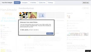
Tours walk you through a number of features in a step-by-step process, and may or may not use flags to point things out on the way. These are often used after a change has been made to the interface,However they can also be used to get people up to speed. Unlike maps and guides, these are done in context of the application or website, and directly walk the user through the important parts of the interface step by step. Often other areas not currently part of the tour are dimmed out to aid with focus and attention.
Tips: Highlighting things you may not have noticed.

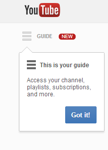
Tips are little bits of information or instruction about ways you can get more out of an application or website, things you may otherwise not discover without advanced or regular use. Often flags shapes are used to provide tips. These are visual call outs that draw attention to a particular feature with a bit of text, These can get new users going, or show a change or new feature in the interface to a user.
To recap…
Good up to speed aids allow you to increase the value and complexity of your application without risking the and reducing learning curve. Advancing users and enabling them to become more productive, efficient, and informed faster. To be fair I have left out tool tips. I am taking these as a given, as they are not used once, or dismissed permanently rather constant reliable fixtures always available to help clarify icons, buttons, and actions in an interface.
Additional Resources
- Tooltips and Infotips: http://msdn.microsoft.com/en-us/library/windows/desktop/aa511495.aspx


Nice article. I think there is a definite problem in business and personal use technology today in that there are often tools for beginners, but then it stops. The only way to move forward to intermediate or expert status is just to dig in and experiment, or reach out to communities and forums for information. Developers of products would be able to better create long term value by providing that next stage of learning tools in an easy to use, subtle format.