Infographic Best Practices
I had the opportunity to help out with an infographic design recently and it gave me to a great opportunity to explore this communication medium in general. There are some really great examples on Pinterest, and I highly recommend that as a tool for visually browsing samples of what is out there. One thing I found really interesting was the lack of infographics on infographics, as in best practices and tips. I felt this was a nice opportunity to create a best practices infographic myself.
Here are the tips I found to be most useful in most circumstances:
- Don’t Type it, Show It
- Have a Primary Visual
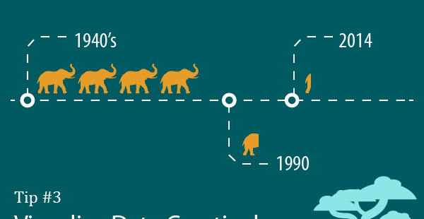
- Visualize Data Creatively
- Headings Create Flow & Anchors
- Use Space, Shapes & Columns
- Less is More, Keep it Simple and On Point.
I think if I were to modify it, I would also add something about color.
