No New Mail – Updated!
I had a specific experience with Gmail lately that left me craving some character and delight. Now I consider character and delight to be two very different aspects of user experience design. Delight is the cherry on top of a good design and character is built in as part of the core brand of the product. However, I would have been happy with either. I think partly because while subtle, I have associated a certain character with Google, a certain personality to this website that left me feeling lackluster after my big accomplishment. Let me explain.
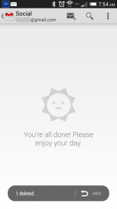
7/9/2014: Update~ I’m happy to announce that Gmail has made some improvements. When recently clearing out my inbox on my phone I saw this fun screen 🙂
Original Post:
After much work and dedication, I finally emptied my inbox! This is a big deal, and not something that happens to me often, if ever. I as I responded to and deleted that last email trumpets went off in my head, a band started playing, and I expected streamers to rain down from the ceiling. But instead, this is what I saw.
Lets start with a review of how I see Google’s personality and then look to see if there is another possible scenario for how Gmail could have handled this accomplishment.
Google’s Personality
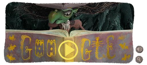
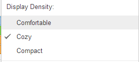
Personality is something that must be considered throughout the design in a number of ways. For example a website can leverage colors, fonts, imagery and communication style to portray their character. It can be a part of error messages, sales hooks, success statements, and even your company mistakes. So what is Google’s personality? Here are some screen shots that I feel highlight their personality as I see it.
Now to be fair, most of what Google does is get out of the way and let the content show as efficiently as possible. Their text is clear, succinct and to the point and their character is subtle. You don’t see it splattered all over the place, but Google does shows hints of character. You can take your chances “Feeling Lucky” with search results, make your mail view “Cozy”, check out the latest logo art, try out the Labs and even change your language to Elmer Fudd. It is subtle, but it is definitely in there.
So after my email accomplishment, I felt a little lack luster by the single “!” at the end of the sentence stating that I have “No new mail”. Being realistic and taking into consideration their subtle but present personality, and the fact that you most often see this same message when creating a new account, I would have still preferred something to this effect instead. Maybe they could even add on a little delight and have a group of canned messages that change each time.


