The Little Things
When designing it is easy to get lost in the forest and forget about the branches on each tree. However it’s often in the branches, the subtle little additions that can make a big difference.
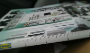
One example of this is something I noticed on the latest IKEA catalog. The binder was also a ruler. This is such a little thing, but shows a certain culture about IKEA and conveys a sense of caring about the customer, helping them in little ways with subtle conveniences.
Another great example of this, and one of my personal favorites, is the way that tabs in chrome will respect their current width while the user is closing tabs, so that the close target is always in the same place. It isn’t until the user moves their mouse away from the tab that the width re-sizes to fill the space inappropriately.
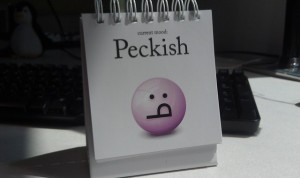
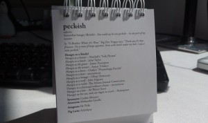
Even the Daily Mood flip display on my desk made my life a little easier by providing mood definitions on the back of each page. This isn’t something that anyone really see’s but me, and for the most part it’s not really needed. But it makes a big difference on those occasions when you do come across a mood that is unfamiliar to you.
What qualifies as a “little thing” you might ask? I consider it to be something that your customers may not notice. Something that is most likely not even a business requirement, but instead added purely to ease, delight, and make your customers lives just a little more pleasant.
There are many great examples out there, but rather than posting them all here, I’d rather link you to the website Little Big Details. It is a great collection of “little things” that help inspire me on a regular basis to take into account subtle additions. Things that only a few may even notice, but will make people’s lives, just a little easier.


