Error: Please contact me at (xxx) xxx-xxxx
I’m giving a talk on forms tonight and to get my head focused I was scanning over some last minute articles on the subject when I came across the best error message idea ever. It’s not for every error message, but just for those really special ones. You know, like the blue screen of death, or the “Unexpected Error” Error.
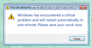
Here is an example of one I have run into (one too many times) lately on my windows 7 machine.
How do you design for these errors? Well, unfortunately most don’t and that’s both the problem and the point. They are unexpected so they aren’t planned for. What should you do? For starters give the user something they can work with, like an error code they can reference, or a customer support number, maybe an apology for not accounting for this error in the first place..
OR
You could give them your personal phone number. This is the suggestion I just came across and I love it:
Give users some hint about what to do next.
“At least try to give users some hint about what to do next.”Rhonda’s advice includes telling the user what to do about an error. If you believe your can’t-ever-happen error message would appear rarely enough, why not put your direct phone number into it? Does doing that make you feel too uncomfortable? How about your email address? Or maybe the contact details for your help desk?
I realize all of these suggestions might seem ridiculously utopian, but this error message was never supposed to appear, so the traffic it generates shouldn’t be all that bad, should it?
Source: Avoid Being Embarrassed by Your Error Messages by Caroling Jarrett
Should you really put in your personal number? Well, that depends on how confident you are that no one will ever see it. I’ll tell you what, it certianlty makes me think a little harder about whether or not I’ve accounted for everything 🙂
