Mobile Date & Time Interactions: Android vs iPhone
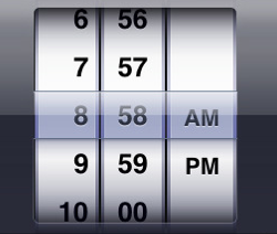
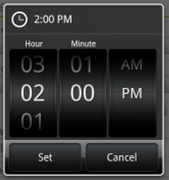
I’m an Android user and I have to admit, when I first saw the iPhone date/time picker I was jealous. The fancy rolling wheels just looked fun and reminded me of a slot machine every time I saw them. However, now that I have updated my Motorola Droid to a HTC Incredible 2 which has the scroll wheel picker, I’m less than impressed.
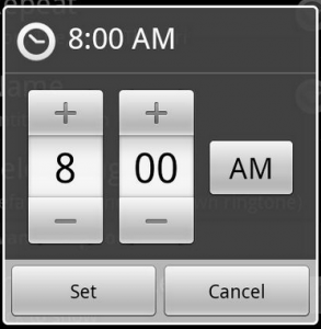
My original Droid featured a +/- option with the ability to manually enter numbers with the onscreen keyboard. While maybe not as cool looking, I found that it was functionally superior for a number of reasons:
- Accuracy: When moving up or down a couple of numbers, tapping the button the same number of times as you need to adjust the number made sense to me. Now when scrolling, the wheel requires more attention and accuracy as I can’t move my finger too fast, or lifting it will cause the wheel to continue to roll. So I must slide my finger up or down, and not lift it until pausing on the exact number I need.
- Speed: When moving across a larger span of numbers, on the Droid I would simply enter with the keyboard the number I was looking for. On the wheel design I often accidently scroll past the desired number, as there is no hard stop. Instead you must guess your drag speed and lift based on desired momentum and the positioning of the number on a wheel. This ultimately takes me much longer to do, then simply entering the number I am looking for.
- Cognitive Load: Finally, I feel that the cognitive load on the scroll wheel is much higher as you can see not only the chosen number but also the number above, and the number below on each visible wheel at the same time. With the Droid picker you can quickly discern the exact time as they are the only numbers displayed. The same goes for AM/PM selection. Additionally, when playing with a friends iPhone I noticed that while trying to scroll the far left wheel I would also accidently scroll the middle wheel.
In summary, while the iPhone has some cool looking tools, that HTC seems to be emulating, when it comes to interacting on a regular basis I much prefer the original Droid design. The up down controls require less attention and accuracy. The ability to manually enter a number is much quicker than scrolling, and requires less focus. Finally, the single number display makes your selection easily discernible, even with a quick glance.


