Don’t Let Forms Get in the Way of Conversions
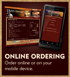
I recently received a tip from a friend that P.F. Chang’s is giving away a complimentary lettuce wrap for “liking” them on Facebook. Now the whole principle of getting a coupon for social liking is another post entirely. The point of this post is about what happened next. I decided that this coupon would be perfect for dinner, and went to the website to place an order online that I could pick up on my way home. The site prominently promotes their online ordering process and even has an app (see below).
I clicked the promo and entered my zip code to locate the nearest store to me. So far, so good. Next I was shown a map with local stores, so I chose the store near me, and clicked the link to “Order Online”. The next page asked me to choose my pickup date and time, which I entered, I then clicked a “Continue” button. I chose my Lettuce Wrap from the menu and added it to my order. Then clicked the “Checkout” button. So far so good right?
The next screen asked me to log into my existing account, or create an account. Why do I need an account to place an order for pickup? I’m sure if I simply called in an order on the phone an account wouldn’t be required, so why is this extra step necessary on the web? Curious, I clicked the button to “Create an Account”. If it’s not to much work, then I’ll just do it.
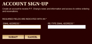
The next page asked me to enter my email address, and then enter it again for verification. Okay, I can do this (see below).
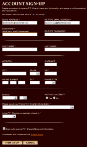
I entered my email address, then entered it again and clicked submit. To my surprise the submit button gave way to a much longer form (see below). They not only wanted my email (which I could understand for purposes of verifying my order) but also my home address, phone number, birthday, confirmation that I’m over 21, and my local P.F. Chang’s Bistro (which they should have been able to discern from my address).
All I want to do is pick up my Lettuce Wrap. I’m not ready for a long term commitment to their website and the marketing that will surely be sent to me after disclosing my location. Why all the hassle, they wouldn’t hassle me like this on the phone.
At this point, I was annoyed by the form, and decided the leftovers in the fridge would be easier than stopping by the restaurant anyway.
So what’s the take-away? Don’t treat your customers like data, just because they are online. Could you imagine if each time you went to a P.F. Chang’s they stopped you at the door and asked if you had an account or not. Then if not, said you had to give them your information and handed you a form? They wouldn’t do it in person, so they shouldn’t do it online. Forms are a commitment, and a conversation, just as in person there is an appropriate amount of information you can ask from a customer based on your relationship with them and the nature of the sale. You would expect a form at a doctors office, not at a restaurant. Treat your customers online, as you would in person. If you start getting too nosy too early, people will get turned off and “walk away”.


