Setting Expectations for Change
I have been a member of meetup.com for quite a few years now, and they have been making a lot of changes. Do I like all of them? No. However, I still admire them for the way they are handling the changes. Many of the principles I wrote about from my notes after an IA Summit talk called “We Love Change? Change is Scary” by Johanna Kollmann are addressed by Meetup.com in how they communicate change. They focus on that transforming idea, as Johanna put it, between rejection and acceptance.
Steps for setting expectations for change:
- Communicate what you are doing.
- Communicate why you are doing it.
- Show the benefit for the customer.
- Give the illusion of choice.
- Follow up with the customer.
- Provide an outlet for the customer to communicate.
Meetup.com Example
I started noticing a new banner (above) on my meetup page when I logged in almost a month ago. It makes it pretty clear that they’re going to be making changes soon. Additionally, it gives me an option to click to Learn More, as well as the ability to Try it out. Both work strongly to foster acceptance.
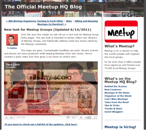
Clicking on Learn More takes me to the official Meetup HQ Blog where I can read all about the changes as well a see a video that tours the new look with existing meetup groups.
Clicking on Try it out immediately changes the page to the new look, but keeps the banner which now gives me the ability to Switch back, or Give feedback. This is an excellent example of the illusion of choice and the ability to communicate back as a customer.
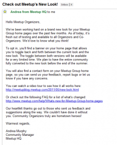
The changes weren’t all left to the website though, I also received an email with links communicating the changes, providing a link to the tour and a FAQ, and describing how to leave feedback. The email was actually sent to me twice, with a subtle variation. The first in May with the subject line ” Special Invitation: Preview Meetup’s New Look!”, and one in June, shown below.
Overall I think they have done a fantastic job communicating the upcoming changes, and giving users a chance to get used to it, as well as an outlet for providing feedback regarding their thoughts and opinions. I’m glad to see meetup doing this, especially since they haven’t always been so diligent in communicating their changes. I think much like Facebook, they have learned the hard way that users have a strong reaction when you move their cheese, most of which can be mitigated with a little preparation and communication.
Below are some additional screen shots of website that have used tours, and early access links to help foster acceptance for upcoming changes:


Greetings! Very useful advice in this particular article!
It’s the little changes that will make the biggest changes. Many thanks for sharing!