Designing the Little Things That Make an Impression
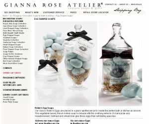
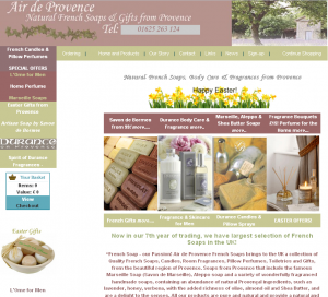
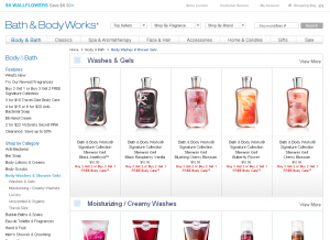
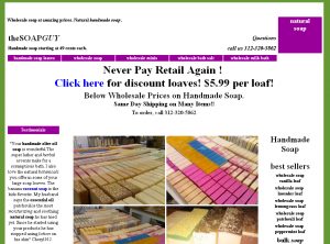
The home page of your web site is your online store-front. The inside pages are the equivalent to customer facing insides of your shop. So what kind of first impression are you giving to your customers? Are you a high end retailer on the posh side of town, a quaintly decorated boutique, or maybe a brightly lit warehouse with hundreds of products? Or are you a small building with plain white walls and price charts scattered amongst rows of products on metal shelving?
What does your homepage say about you?
What if in each of those examples, each of those locations all sold the same one product, soap. Which place would you want to buy your soap from, and how much would you be willing to pay at each of those places? Even if each location is just a warehouse in real life, which feeling, which brand, which type of storefront do you want your customers to “see” when they look at you online? Are you a low-price all in one shopping center, or a one-of-a-kind hole in the wall trinket filled treasure?
The inspiration for this article comes from a great post by Seth Godin entitled Telling a story on the label. In his post, he talks about just that, soap. But not just any soap, instead a particular bottle of AHAVA soap that tells a story. That reaches out to the customer and says “I’m fascinating, unique, luxurious, rare, authentic, and worth the extra $17.”
It’s about the perceived experience.
We pay for the experience. For a story that we can think of every time we see the product, a story that reflects on the way we want to see ourselves. The most important thing to remember is that it is usually the little nuances, the details that make the story important. What is your online storefront saying about you? Does your customer’s first impression match the brand, the story, you’re trying to convey?
Here are a few examples of different online storefronts, continuing with the soap concept:


