Action Buttons, Designing for Use
A couple weeks ago my email subscribers received a link for a “new post” that didn’t go anywhere. It’s not that the page was broken, or that the post didn’t exist. Instead the problem was that I was working on a new post that was not yet finished and accidentally hit the “Publish” button, instead of the “Save Draft” button. Of course, like any typical user, I blamed myself.
“Oh crap, I didn’t mean to do that, I hope it didn’t send an email to all my subscribers”. I then went on to check my email, and sure enough a new post update had sent out right on cue. Unfortunately, my post was far from ready. So I immediately looked for an option to un-publish, that I hoped would stop the email link from working. Much to my dismay the un-publish button didn’t seem to exist. So I employed a crafty little workaround, and copy and pasted my post content into a new post record, giving it a new URL, and deleted the original which then “broke” the old URL that was sent out.
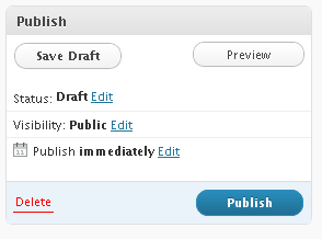
After all this I still blamed myself. “Geesh Lauren, you should really have known better!” …but then it occurred to me, while some of the responsibility was indeed mine, it was not ALL my fault. Take a look at the screen shot to the right. This is what the action buttons for the page look like while I’m working on a new post.
There are a couple interesting things happening here:
1. The Delete action has been made secondary to the Publish action. It takes up less visual space, has less contrast than the white “Publish” text on the dark blue button, and the text is not bold. The Publish button is definitely the clear winner. In fact the Publish button has the highest level of contrast, and visually pop’s from the page more than any other element anywhere, not just in this publish box.
2. The Edit links which allow you to edit the settings for the post are presented as blue links that open options panels. The blue links have a clickable affordance but almost fade into the background until you go looking for them. They are very close in proximity to the bold black text next to them, and don’t really stand out from any other area on the page until you focus on them.
3. The Save Draft and Preview buttons are given the rounded button status, but no color. In fact the rounded button status almost does nothing to call out these buttons aside from outlining them. The text is still dark/gray black, and only Save Draft is given bold formatting. In addition, these buttons are placed at the top of the Publish container, even though the primary Publish actions is at the bottom. These buttons are given nearly a lower priority than the Delete link. Even though the Delete link isn’t a button, it has the advantage of color contrast and proximity to the primary action on the page.
4. Once you Publish, if you have an email alert tied to your post there is no way to cancel out of the action.
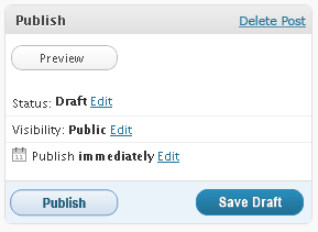
Looking at all of these things combined, you can see how the interface is partly to blame for this mistake. In a editing workflow where it is typical for an individual to write in multiple sessions, or work on drafts the interface should highlight the Save feature. You cannot make a mistake by saving. Until you leave the page your actions are still reversible by a simple undo. Yet this is not the primary action being visually identified. Instead Publish, the irreversible action is given top priority. By simply rearranging the visual impact of these buttons and placement, this form could have helped me to avoid this mistake.

