Forms: Comcast Sign In Redesign
Regardless of the vast information available on form design best practices there are online forms everywhere which break many of the standards. Forms stand between users and your product or service and should be given priority as a major portal to your business.
Forms should focus on the point. They should be simple and should not include unnecessary text or requests for information. Labels should be intuitive and obvious. If the user’s login is an email address the label should be “Email” not “Username” or “Login”. Each form should have a clear goal and purpose which is clearly communicated to the user. While the user is filling out the form the user should always be aware of what’s going on, and any errors they may create.
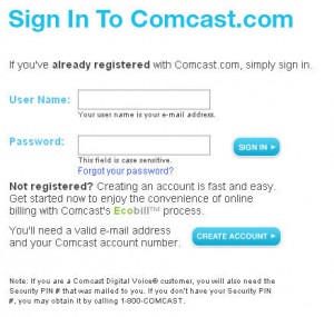
You can see the Login form for Comcast.com below. As well as my changes to this form to improve its usability.
Clear Language and Expectations
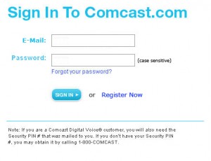
First I would clarify that I am looking for the users email address to login by replacing “User Name” with “Email. I can now also eliminate the text below the email input field.
Reduced Clutter
Next, I would remove the text above the login that says “If you’ve already registered…”. This is unnecessary as I can clearly see where I’m supposed to login if I have an account.
Focus on the Goal
Then, because the two action buttons “Sign In” and “Create Account” are competing for attention I would visually change the style of the “Create Account” link to show that it is a secondary action. Still visible, but no longer competing for attention especially considering the main point of this page is to sign in, and the user has already clicked a “Sign In” link to get to this page.
Remove Unnecessary Happy Talk
I would then remove all the marketing text for creating an account as it is mostly noise on this page. Anyone interested in creating an account can simply click the link. The marketing for new users is already being done on the homepage.
Now I have minimized distractions by reducing the clutter, improved the clarity, reduced the chance of mis-clicks and focused on the primary goal of the form. See my redesign below:
If I were going to go further I would improve the error validation to identify when the user entered an incorrect email address versus when they entered a correct address and a incorrect password.


Good point about “happy talk”! I think it’s easy to blur the line between necessary, informative text and filler text and really an art to pare things down to only what’s necessary.