Who Moved My Stuff?
Change is good, and it’s important to keep your site up to date. However change can also be hard to handle, especially when you feel as if you’ve had the rug pulled out from under you. Which is how many users feel when they go to a familiar site and suddenly everything is completely different.
This is something to keep in mind when making changes on your website, specifically in account based websites. When someone creates an account and has “private” pages they form a sense of ownership with these pages. “They have my stuff on them, therefore they belong to me now”. This can be good in some sense as it indicates loyalty, but what happens when it’s time to update the site?
“…validate changes before you make them. Test, test, test…”
Major changes can quickly be interpreted as you “moving my stuff” and most people aren’t fond of the idea of someone else moving their stuff around. This is especially true if they’ve spent a lot of time getting to know the site. They’ve learned all the necessary paths to get to their information, the bugs, and the workarounds, and how to get things done. Now you’ve gone and messed that all up, they have to start all over, figure out where you put their stuff, how to get things done again, and so on. So how can you make this transition an easier one?
Communicate
First, be upfront with your users. Let them know a change is coming and if possible provide a link to the new design. Explain exactly when the change will happen and why it’s being changed. This will help them start to warm up to the idea and begin to form a connection with the new design. Below is an example where facebook does just that:
Give your users a chance to respond and provide feedback before the change is made. Not only will this help in their acceptance by showing that you value their opinion, but it will also provide valuable feedback to you about the new design. Just keep in mind a resistance to change when sorting through the comments and focus on the constructive feedback.
One Step at a Time
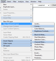
When making the changes, take baby steps. Make changes incrementally over time. This is much easier to do in websites than in traditional software that requires bundled releases. Because you host the site you have the benefit of making changes to what the user sees incrementally. This will aid in user acceptance as users will have a chance to warm up to each change without being overwhelmed. For example focus on one area at a time like adding new features, redesign a process, changing the graphics, or modifying the layout, just don’t do it all at once. Then aid the users in understanding the change. Explain how the new process works or why this will benefit them. Below is an example where in Adobe Photoshop CS3 they highlight each new feature in the menu for easy recognition:
Test and Validate
Lastly, and most importantly, make sure you validate changes before you make them. Test, test, test. A change is hard enough to accept on its own, but it’s even worse when the change isn’t perceived as a good one. A change for the better will be much easier for people to accept and begin to enjoy. Something that makes their lives simpler, or corresponds with a fix they’ve been waiting for will give them a better appreciation for you and your site. Now you will be “tending to their needs” instead of “moving their stuff”.


This post goes hand in hand with my current facebook status “Doug Mays doesn’t like the new facebook layout…looks nice but i cant find anything. Where are my events??”
If i can remember correctly this is Facebook’s 4th time around drastically changing the layout, leaving many users confused. I think Facebook could take a gander at this post and learn a little something, baby steps. Facebook does come out with some very nice changes and good ideas, but they wrap it inside of newspaper wrapping paper, getting ink all over and leaving your hands feeling rough and dirty. They communicate well when they are going to change the layout, usually a month or 2 in advance they say “change is coming, here is a preview”….but they dont give you the option to opt’d out or give feedback. Its there way or the highway, and in a Microsoft-like fashion…we all submit because they have the power to do so.
Apple took a totally different approach back when they transitioned from there Classic OS (7,8,9) to OS 10 (OS X). Mac OS 10 was 100% different from the classic OS and alot of people were weary about changing, I know i was. Prior to that UI shift, i had been a mac user for my whole life up until that point, and i felt like an idiot not knowing the first thing about the new interface. But Apple gave you a way out, you could still use classic, which was great! I kept using the Classic OS and every once in awhile dabbled around in OS 10 and slowly learned my way around. Now i would never go back to the Classic OS.
Baby steps is the key, Facebook i know your smart and you DO have tons of great ideas. But don’t throw them all at us at once.
Great Article and good timing.