First Impressions Count
First impressions are worth a lot on the web when competition is only a click away. So what first impression are you giving people when they come to your website? Does your site seem confusing, overwhelming, without focus? One of the most common mistakes people make when creating their homepages is forgetting about their users and first impressions. Many homepages are bogged down with useless text, a mess of links and images and no clear statement of what they do, or what their users can do on their site. It’s important that you’re clear and obvious on what you have to offer and the value you can provide.
The Test
Take the 5 second test to find out how you’re doing:
Take a screen shot of your website and print it in black and white. Show it to family and friends who may not be familiar with the site, but only let them look at it for 5 seconds. Can they tell you the company the website was for? What does the company do? What would they do next on the site? If they can’t figure this out, without your prompting, then your homepage could use some work. Keep in mind, people will give your site a lot less than 5 seconds time on the web.
Focus on the Goal
So where do you start? First, take a minute and write down the purpose of your site. What is the primary goal of your business? For example it could be “Sell t-shirts” or “get users to create an account: or maybe “get users to apply for a quote”. It should be simple and there should not be more then one or two core goals. This is what you should focus every decision you make around. How does this affect my core goals. They should be the most important focus of your homepage. Be clear and concise. Your users should quickly know exactly what you’re about.
“…People did not come to your website to admire its design, and read about how special your company is…”
Why are you Special?
Secondly, think about your customers. What is the benefit to your customers if they do business with you? This answer should be directly tied to your core goal. For example, if your purpose is to “Sell T-shirts” then your user benefit should be to get a t-shirt from you. Then take it one step further. What about this t-shirt makes it worth it? It could be “trendy”, “designer”, “customized”, “retro” etc. It is important to define what sets you apart, what makes your shirts unique?
Clear Call to Action
Lastly, you need to let the users know what the next step is. A clear call to action. What do they need to do to get things moving with the transaction? It could be as simple as “Sign up here”, or “Browse our Collection”. What ever it is make it obvious and visible. Any images you add should tie directly to your goal to assist in its message. For example if you sell t-shirts show some of them, if you sell software provide a demo, etc.
Summary
These three steps make up the primary focus and most important area of your homepage. This should be a simple call to attention and should not be bogged down paragraphs and paragraphs of info about the details of your company. Think about the top of your homepage like a billboard on the road. You only have a few seconds to grab your users attention and get the point across. If you have more than 1 solid paragraph of regular text, then you need to cut your text in half, then in half again.
Important Note
Now prepare your self for what I’m about to tell you…. it is a hard truth to accept but I feel it’s important to say. People did not come to your website to admire its design, and read about how special your company is. They are not interested in the details of your mission statement, or how proud you are to be serving them. They are only interested in one thing. Getting a task done. It may be as simple as buying a t-shirt, or as complex as doing your taxes. Either way the truth stands, that they have a reason for visiting you before they have even landed on your page. Everything you add to the site that is not part of this task is simply getting in the way.
Now to be fair, there are a few wondering souls with the spare time to investigate your site in its entirety. These people are rare, but they do exist. For these users simply make sure that the information easily accessible. Start with general links, then move to summaries and details on subsequent pages. Leave it up to the user to decide how far they want to go beyond your primary tasks.
Examples
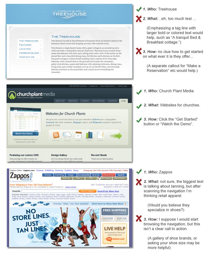
Now that you have identified your purpose, user benefit, and call to action you are on your way to success with a clear and obvious first impression. Below are some examples, see if you can tell who they are, what service they offer, and how to get started:

Very thought provoking and clearly applicable to many of today’s web sites. It’s easy to actually lose the true purpose of why the site is there. We definitely need to test our websites after reading this!