Guess What?
One of the core principles of good design is clarity. Interactions on the web shouldn’t make your users guess. As Steve Krug’s first law of usability states “Don’t Make Me Think!”. Anytime a “guess” is brought into the equation you are adding unnecessary thought bubbles above the users head. The more challenging a website is for a user to use, the less likely they will use it.
This is such a core principle, that I am always completely and utterly amazed when I come across interactions like the one I outline below.
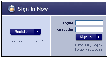
On the following site you are asked to login to your account to get started. Ok, sounds easy enough. Having used the web for many other account based websites you are aware that the label “Login” is typically asking you to enter your “user name” (a unique set of characters you have previously chosen to identify yourself) Of course the obvious question is why didn’t the website just put “User Name” as the label in the first place.
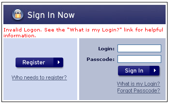
So you enter your User Name, one you may use often with a simple variation for sites like this, and of course a very unique secret password only known to you. But then, something happens. You get an error.What do you mean it’s not right? Maybe I typed it wrong? That seems to be the right combination I would have chosen? These are just some of the question you may ask yourself. So you try again assuming you must have just typed something wrong…and bam. Another error!
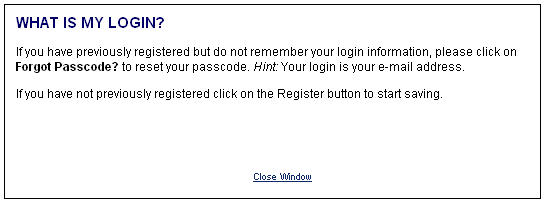
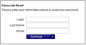
Maybe I used something out of the ordinary for this site? Maybe I typed something wrong when I signed up? Maybe there’s a problem with the login? Again, more questions you may be asking yourself. So now you take the initiative to follow the directions in the error message and click the link for “What is my Login”, and you receive the following popup: Now you see it. Your login isn’t actually a user name that you have created, it’s your email address. Why couldn’t they have just told you that in the beginning? Not only would they have eliminated multiple questions you had to face, but they would have gotten you past the login screen in one try instead of three. Not only do you now feel silly that you didn’t know better, but you’re probably a little upset with the site for not just saying what it wanted in the first place.Now that you’ve gotten past the “Login” ordeal, just imagine if you can’t remember your password. Considering you have many online accounts, it’s not surprising that you may mix up a password here and there. So now you click on the “Forgot Passcode” (which may also make you wonder why it’s not just called “Password”) and you get the following page:
Now that you have been through the Login process, you know that your Login is your email. So what they are asking you for is your email, your last name, and your email again. Why couldn’t they just call both fields Email? Or even make one a “Confirm Email”.Now you’re probably upset that it’s so easy for someone else to reset your password. All they would need is your email and last name (which is usually part of your email address). Not even logged in yet, and you have probably lost a lot of respect for this website, and are frustrated that what should have been simple, turned out to be quite a chore.
While the user interaction above is hypothetical, the form is not. It is a live form currently in use by this website. As designers it is important to remember that each little piece of your design has an impact on the whole. Don’t try to be cute, or witty with your interactions. As soon as you sacrifice obviousness, you begin to sacrifice quality.
Just because your website is handling the customer interactions doesn’t mean it shouldn’t employ good customer service. Pretend you are dealing with this user face to face. If you want to make a good impression every time, create a website that will provide pleasant and obvious interactions every time. Never take for granted what a little bit of discount usability testing can do to help point out some of the obvious opportunities that are sitting right under your nose.


I hate that, I never remember that I need to enter my email address on those types of sites. Nice article.