IA Summit 12: Designing for Cross Channel Experiences
For my first workshop at this years summit, I chose Peter Morville and Samantha Starmer’s Cross Channel Experiences. And for the first time this year, I will be attempting to blog about the highlights of presentations I enjoy using the WordPress app on my iPad. We will see how it goes, hopefully my spelling and grammar doesn’t run amuck.
I very much enjoyed this workshop and felt it was relevant to current issues many are facing. Companies are struggling to catch up with technology and create the pervasive cross channel experiences that consumers are starting to demand. But what does creating a good cross channel experience mean? Does creating a iPhone app, or mobile website allow you to tick this initiative off your list?
Communicating Information
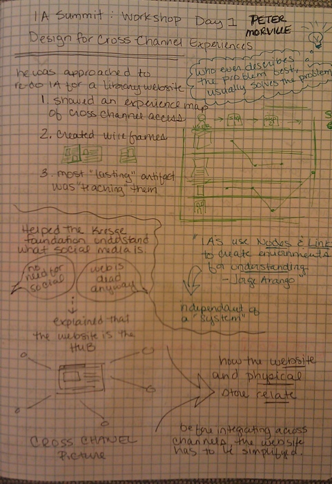
Peter started this session with a discussion of Information Architecture and some examples from projects he worked on. He summed up his approach of a Library project with the following takeaways:
- I did some research and created an experience map to show patron usage across all access channels for the library
- Next I created wireframes
- But the real takeaway was the lasting artifact of teaching them and giving awareness to the issues.
Who ever describes the problem best, he says, usually solves the problem. Peter then shared the following quote by Jorge Arango:
“IA’s use nodes and links to create environments for understanding.”
For the Kresge Foundation he helped them to understand what social media is all about. At first they felt that there was no need for social influence, and one member even said that he read that the “web was dead”. But what Peter explained was that the web was not only alive, it was the hub of the cross channel experience. It is about how the website and the physical relate. Before cross channel integration can be accomplished the website has to be simplified.
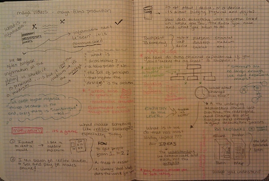
Peter then showed a few videos on Information Architecture from Maya Films, one I particularly enjoyed called Information. Which talked about what information is. That information is not something that can be seen, but rather it is something which is communicated. We often confuse information with the form or medium in which the information is presented. But it is not the medium, it is the message. Peter ties this back to an architectural blueprint, and notes that it is not the design, but the set of principals that informs the design that creates Architecture.
Peter then shared the word of the day, coined by Ted Nelson, Intertwingled. A term that signifies that no matter how hard we try to organize and classify things into hierarchical trees, in the end there is no prescribed division, only our knowledge of information.
Bridging the Physical and Digital
This leads into the next phase of the conversation about physical and digital mediums. He uses Redbox as an example. What makes Redbox successful, especially in today’s technology driven society where streaming is becoming more and more popular? Peter talks about the convenience of the physical Redbox machines, and then moves into their phone app, highlighting how the two work together.
It’s about how to get people connecting between both the physical and the digital, motivating people to connect the two. He also uses his library as an example of this, in the way he can easily search their online website for a book, enter a quest, and then go to the library and quickly get it from the hold shelf where it has been set aside for him.
“it’s not about 1 device, or a device… it’s about bridging the physical and digital. How does everything work together based on where you are, the device you have, and what you want to do?”
Corporate Support
He then briefly discussed the touch point taxonomy which can be seen in his slides (posted below). Peter explains that sitemaps are no longer good enough for the complexity that needs to be explored, we need to be creating experience maps. But, more importantly, cross channel experiences can’t begin if you don’t have the org chart at the company to support those experiences. All groups need to support all channels. An empathy for the user will make the experience better.
The website also has to have the architecture to support cross channel experiences. The website of course will change over time, but those changes should be on the face of the website, surface level redesigns. The underlying architecture should last over time, good architecture persists.
As user experience professionals, and information architects our job is to help foster that understanding. It is our ideas that will have the most lasting impact. The understanding that we communicate and teach more than our artifacts.
Paths and Maps
Next Peter shows a brief video from Bill Verplank that discusses paths and maps in design. Paths, the video explains, are easy, specific, and step by step. Paths can be described similar to a basic soda vending machine. You put your money in, press the button for the flavor of soda you want, then you hear the soda being dropped to the bottom where it appears in a shelf and you collect it.
Maps on the other hand are like a snack vending machine they provide ore options. Snacks are displayed on shelfs with number and letter codes, and prices. Once you decide on the snack you want, you enter your money and press the correct letter and number combination on the keypad. The spiral display holder spins, and if your lucky the snack will drop to the bottom. If not, you may end up shaking and pounding on the machine until you can get the snack to release.
Paths are easy and step by step, maps are more complex but offer more possibilities. The ideal combination for a design is to incorporate both.
The Ameriprise Experience
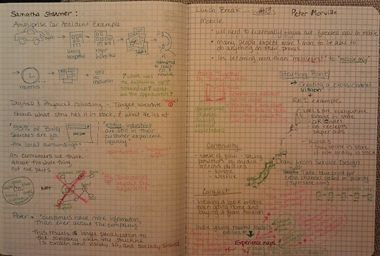
Samantha was next and started her talk with a story that walked the room through her experiences with an insurance company after a car accident she was involved in. After the accident she called the insurance company, who sent her to the wrong hospital, a few weeks later she began receiving all sorts of mail form various members and departments of the insurance company. She tried reaching out to them on the status of her claim several times, but was not able to get an answer. Some time passed, and she got more mail, one post card which stated that the insurance company had been trying to get ahold of her. She called, but they told her to ignore it. She received a bill from the hospital and called about that too, no help with that either. More than 8 months later the claim is still not resolved and she can’t even get information on the status of it.
This led into the first exercise. Where was the experience most screwed up? Where we’re the opportunities?
She then talked about the consumer view. As consumers we perceive the company as a whole, not as it’s parts. All touch points affect our experience and impression. It is important for companies to identify opportunities, or moments of truth in the experiences they provide. There is a lot of work to be done, as many industries are still in their customer experience infancy.
Mobile Experiences
After lunch Peter began by speaking about mobile experiences and how we will need to eventually figure out faceted navigation on the mobile device. Many people are beginning to expect the ability to do more and more on their phones. This is shifting the focus from mobile-first to mobile-only.
Cross Channel Vision
The conversation then moved into defining a vision for cross channel experiences. Much of the vision peter says, will draw from roots in service design. REI (where Samantha works) is then discussed as an example of successful cross Chanel experience design. Followed by a brief discussion of Tyler Tate’s blueprint for cross channel design. The blueprint focuses on prioritizing channels based on top user tasks.
Experience Maps
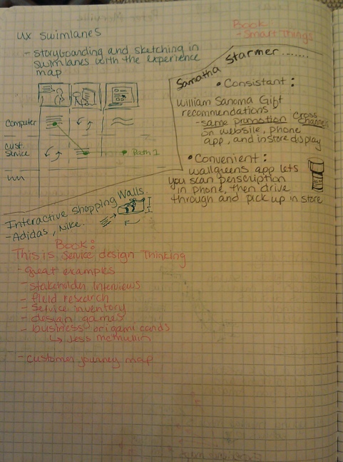
Experience maps become the next topic of conversation, with many people in the room chiming in on their experiences. Peter explains how Indie Young’s mental model work was ahead its time but has evolved into experience map design. It all starts with stories. Many people in the group note on the fidelity of these maps, and encourage less detail and more iteration. Peter shows many slides outlining examples of experience maps and an example of storyboarding and sketching in swimlanes with the experience map. The conversation is concluded with the note that experience maps a valuable as a communication tool, not the final product. They are the beginning of an important discussion.
5 C’s
The talk ended with Samantha covering the 5 C’s for cross channel design: Consistent, Convenient, Connected, Contextual, and (a)Cross time. Each had different brand and company examples of ways they applied to cross channel design And can be seen in the slides (posted below).
Resources
Throughout the talk, the following books were recommended by Peter and Samanatha:
- What’s Mine is Yours – Not technical, but a good read on collaborative consumption
- Thinking in Systems
- Alone Together by Sherry Turkle – Research on adolescent social usage and generational changes that are driving mobile expectations.
- Smart Things
- This is Service Design Thinking – Great examples of methods and deliverables.
Slides:
My Sketch Notes:


[…] keynote was given by Peter Morville and was pretty much a solid summary of the workshop I attended by him at the IA Summit. He started by introducing the term intertwingled and discussing how we define Information […]